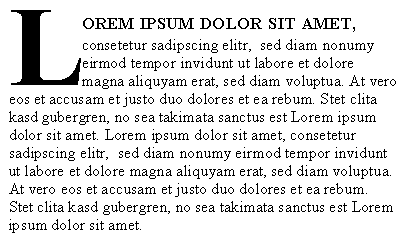
No—we're not referring to the stock market! Have you ever noticed type set in small caps? They are capital letters that are reduced in size and replace lower case letters in a selection of text. You will often find small caps used in headlines or titles, or to emphasize selections of text. Acronyms, such as FBI or USA also look great set in small caps.
Examples of Small Caps:


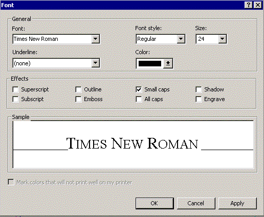
Setting Text in Small Caps in MS Publisher
To set small caps in your Publisher document, simply select the group of text you want in small caps by highlighting it. Then from the pull down "Format" menu, choose "Font." Then check the "Small caps" box. Or, to make things even easier, use the keyboard shortcut of Ctrl-Shift-K. To remove the small caps, you can use the same keyboard shortcut.

This is a simple way to get small caps into your newsletter. However, they are not "true" small caps. Typographically, small caps should be set at 80% of the regular type. For example, if your text is set at 12 point, the small caps should be set at 9.6 point (simply multiply the size by 0.8 and enter the result into the "Size" box on the Font menu.) The difference can be subtle, but it makes your text look more professional. To illustrate the difference, take a look at these examples:

It still isn't perfect--if you look closely, you'll notice that the stoke widths on the larger capitals are different than their smaller counterparts. To get this right typographically, this should not be so evident. However, it should do for most applications. The only way to get small caps completely accurate is to set each group by hand--generally not worth the effort, unless you are producing a document that will be scrutinized extremely closely (and mainly by designers, at that)! For all practical purposes, no one will ever notice.